Reusable Social Icons
A CSS library of reusable social icons.
How many times have you started a project that had a requirement for some sort of social following or sharing and had to recreate the CSS to display the individual icons required? This is something that we’ve encountered on multiple occasions and therefore felt the need for a CSS library of reusable social icons that we could include in any project and have it usable within minutes.
The Idea
Almost every project we work on requires usage of some social icons. We use the Icomoon App to generate web fonts with all the social icons we need, then use some sass magic to load the fonts and map each icon to a CSS selector. Considering this is something we do so often, we felt that it would be beneficial to build a library that could be reused on all our projects that would give us social icon selectors for a variety of social platforms without having to rebuild it each time.
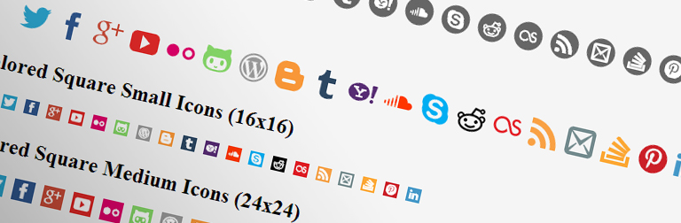
We also wanted the library to have out of box support for multiple icon sizes (16×16, 24×24, 32×32, 48×48), multiple icon styles (plain, square, circular), and support for different colors. With this comes the requirement for customization, and if using SASS, you can override multiple variables that will allow the customization of sizes, styles, and colors.
We’ve open sourced the library making it available on GitHub. It can also be installed using Bower with the following command:
bower install 76d-social-icons
Supported Platforms
The following is a list of social platforms supported by the library:
- Twitter
.si-twitter - Facebook
.si-facebook - Google+
.si-googleplus - YouTube
.si-youtube - Flickr
.si-flickr - GitHub
.si-github - WordPress
.si-wordpress - Blogger
.si-blogger - Tumblr
.si-tumblr - Yahoo
.si-yahoo - SoundCloud
.si-soundcloud - Skype
.si-skype - Reddit
.si-reddit - LastFM
.si-lastfm - RSS
.si-feed - Mail
.si-mail - Stack Overflow
.si-stackoverflow - Pinterest
.si-pinterest - LinkedIn
.si-linkedin
Usage
Simply include the social-icons.css, or social-icons.scss if you’re using Compass / SASS, and use the following the .si along with an the accompanying icon selector (ex. .si-twitter).
Set your desired size:
- 16×16
.si-small - 24×24
.si-medium - 32×32
.si (default) - 48×48
.si-large
Set your desired style (default is no background):
- Square
.si-square - Circle
.si-circle
Use .si-colored to use the colored version of the icons.
If you’re using the Compass version, most of the variables defined in the _variables.scss can be overridden if you’ve defined them before loading social-icons.scss. For example, setting the $siDefaultColor variable will override th default color of the icons.
Final Thoughts
This library is still in its infancy, so there may be platforms that we aren’t supporting yet. If there are platforms that you’d like supported that aren’t currently, let us know and we can add them in. Hope you enjoy!