Re-ordering Content with Bootstrap 3.0

Re-ordering content from one device to the next without changing the DOM using a mobile first grid system
The requirement of having to build websites that work on any device can sometimes bring challenges that we would not normally run into. In certain cases, you may want your content to display in a certain order on some devices, but on others, you’ll want to display it in a completely different order.
For example, on mobile devices, we may want the main content to display first and, what would be considered sidebar content, to display after. However, on a desktop, we want the sidebar content to display first, on the left, and the main content second, on the right. So the challenge is then, how can you change the display order of content without changing the structure of the DOM. This post is intended to help solve that problem by taking advantage of Bootstrap 3.0’s mobile first fluid grid system.
Traditionally, we would consider how we would want to display our content on a desktop first. If we wanted our sidebar on the left and followed by our main content on the right, we would put our sidebar content before the main content in our html markup. However, on a mobile device, this will show the sidebar content first, then below that, the main content.
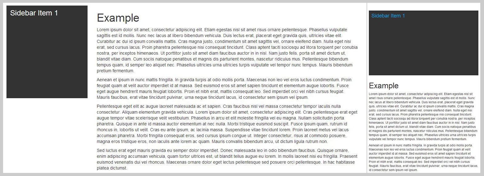
Example of our sidebar before our main content in the html markup. Desktop on left, mobile on right.
Not what we’re looking for.
If we consider a mobile first approach, we would switch the order of our main content and sidebar by putting the main content first. Now, on a mobile device, the main content displays first, then the sidebar content displays below. But on a desktop, this puts the sidebar to the right of the main content rather than on the left.
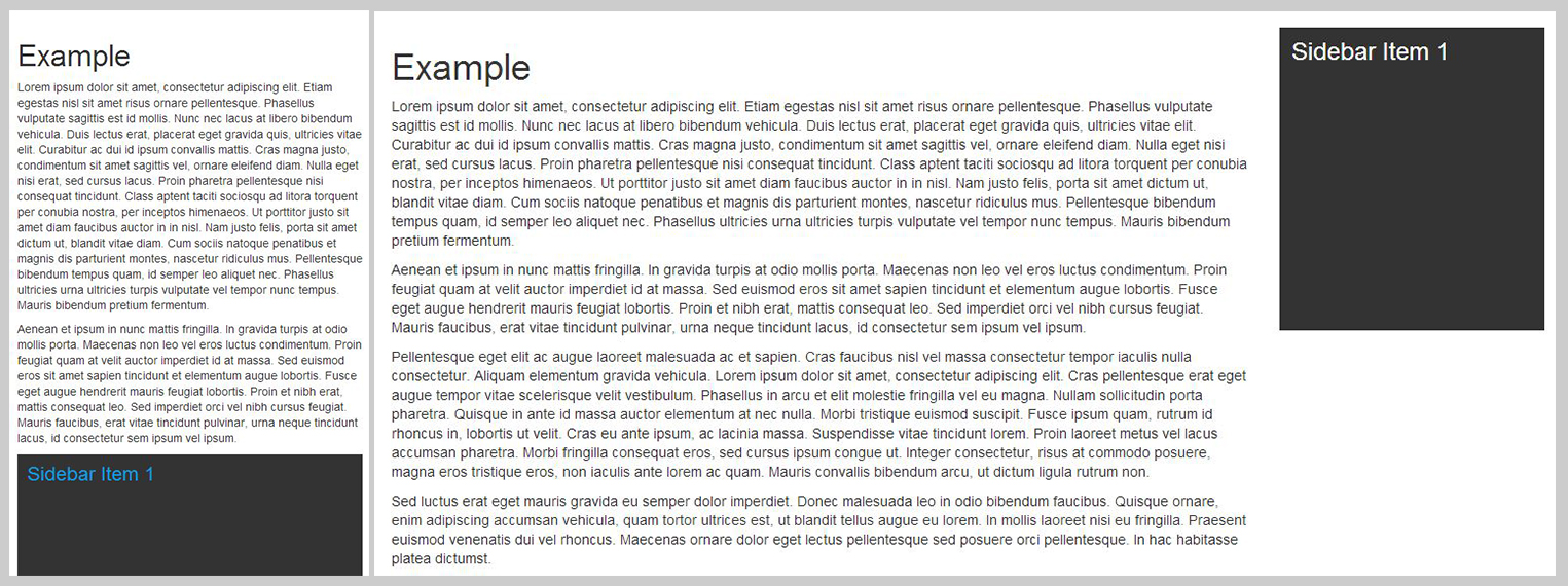
Example of our main content before our sidebar in the html markup. Mobile on left, desktop on right.
Again, not what we want.
So, how can we get the main content before the sidebar content on a mobile device, and then on desktop, have the sidebar on the left and the main content on the right. Consider the following html block which uses Bootstrap 3.0’s mobile first fluid grid system:
<div class="container">
<div class="row">
<div class="col-md-9 col-md-push-3 main-content">
<!-- Main Content Here -->
</div>
<div class="col-md-3 col-md-pull-9 sidebar">
<!-- Sidebar Content Here -->
</div>
</div>
</div>
Here, we’re still taking the mobile first approach of putting the main content before the sidebar content so that we see the main content first. But then on desktops (or medium devices) we apply a push of 3 columns to the main content and a pull of 9 columns. The net effect here is that on desktops, the sidebar content now gets pulled over to the left and the main content is pushed to the right, giving us the proper desktop layout we’re looking for but not effecting the order on mobile devices.
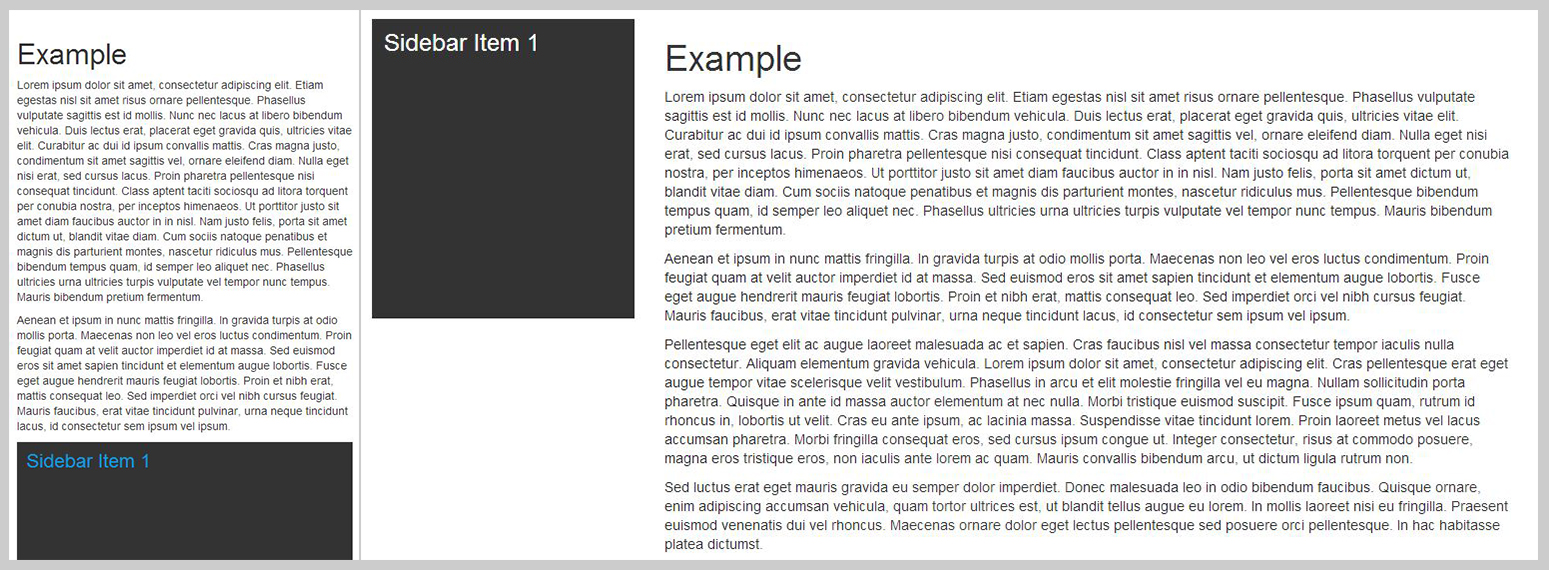
Example of main content before sidebar on desktop with a “push” on the main content and a “pull” on the sidebar. Mobile on left, desktop on right.
Not only does this provide us with a proper mobile first responsive markup, but also, from an SEO perspective, this gives us a better structure with the main content coming before the sidebar.
I hope this helps anyone finding themselves in a similar scenario.
Pingback: Make web development, and your life, a little easier | Thornley Fallis()